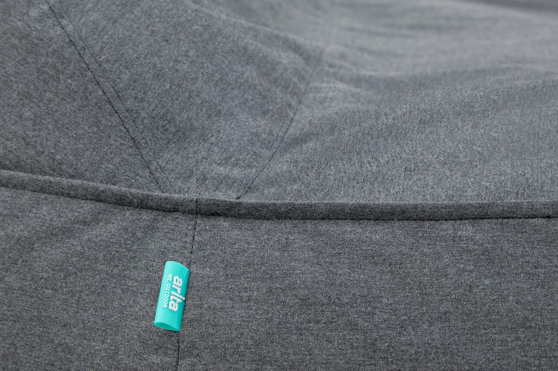
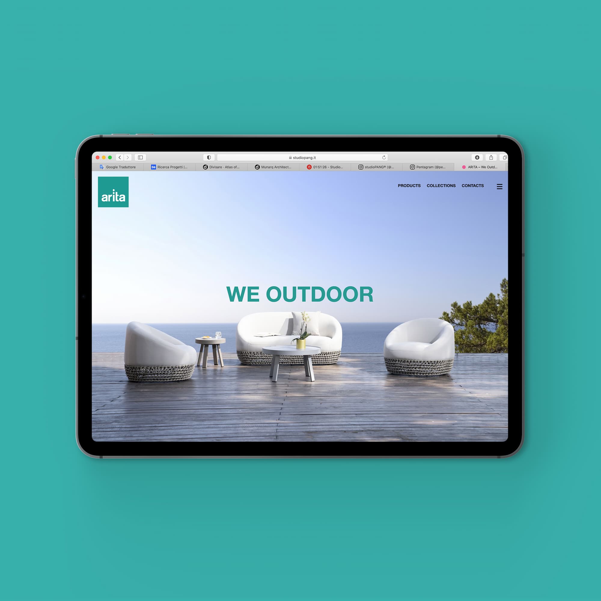
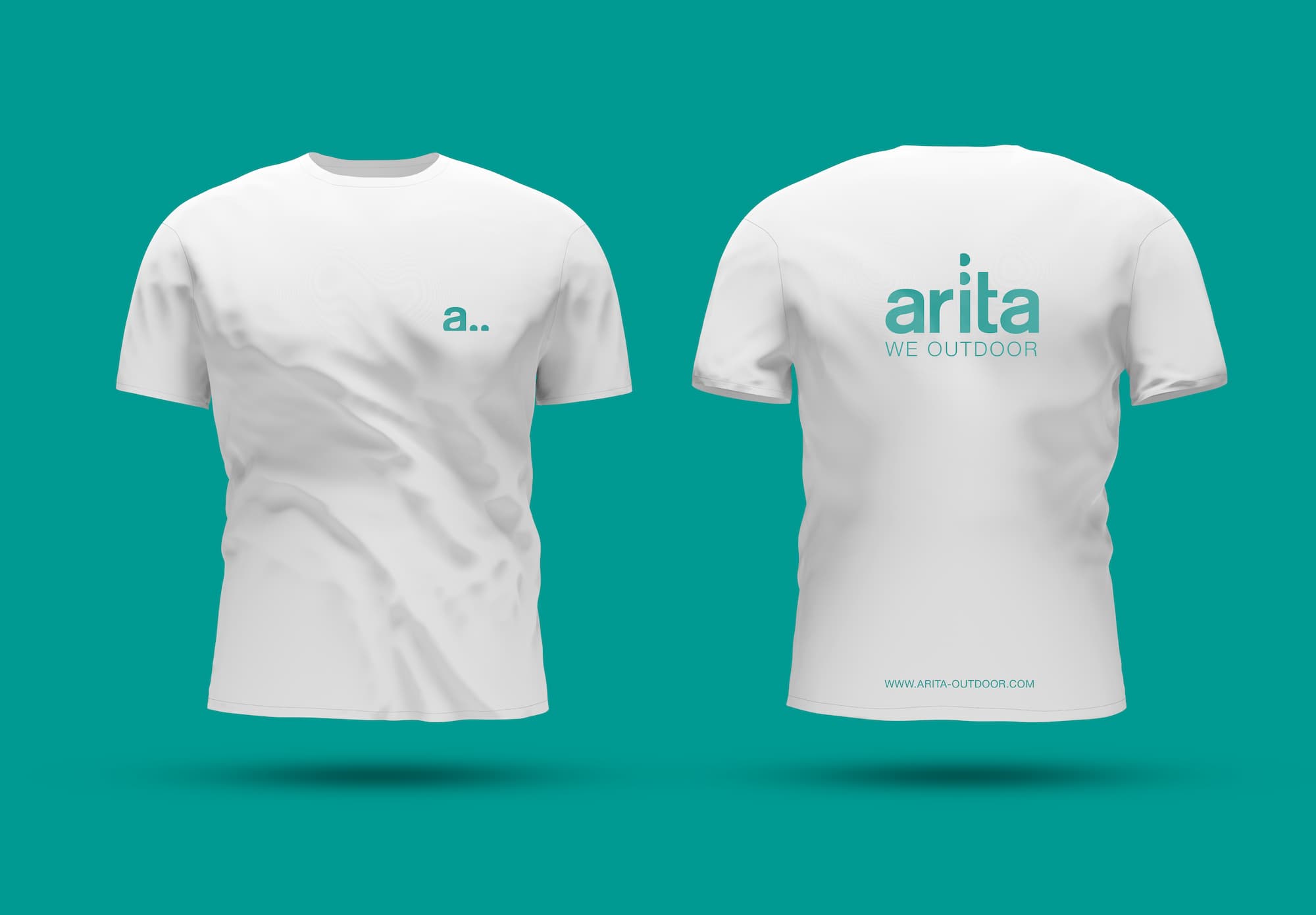
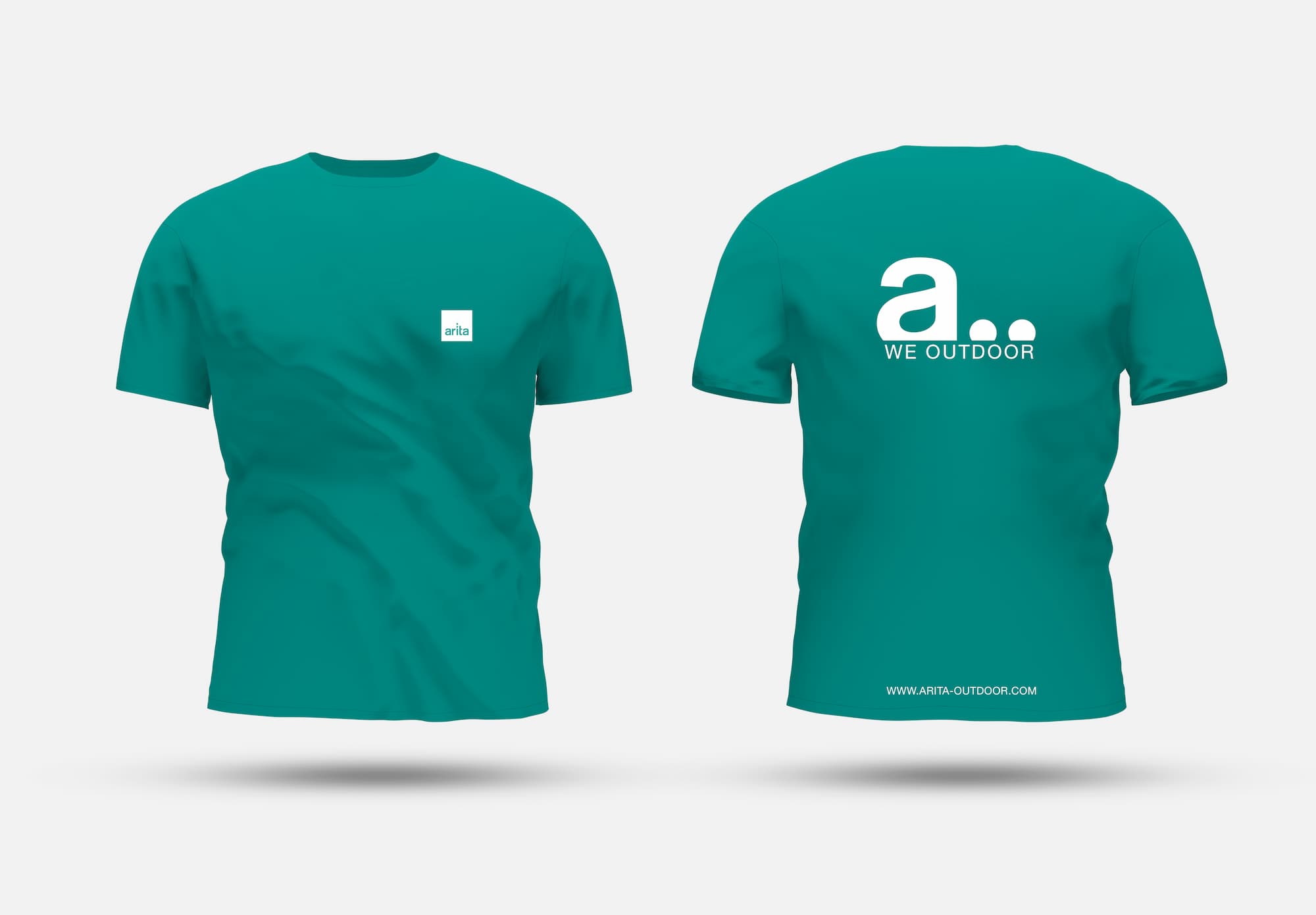
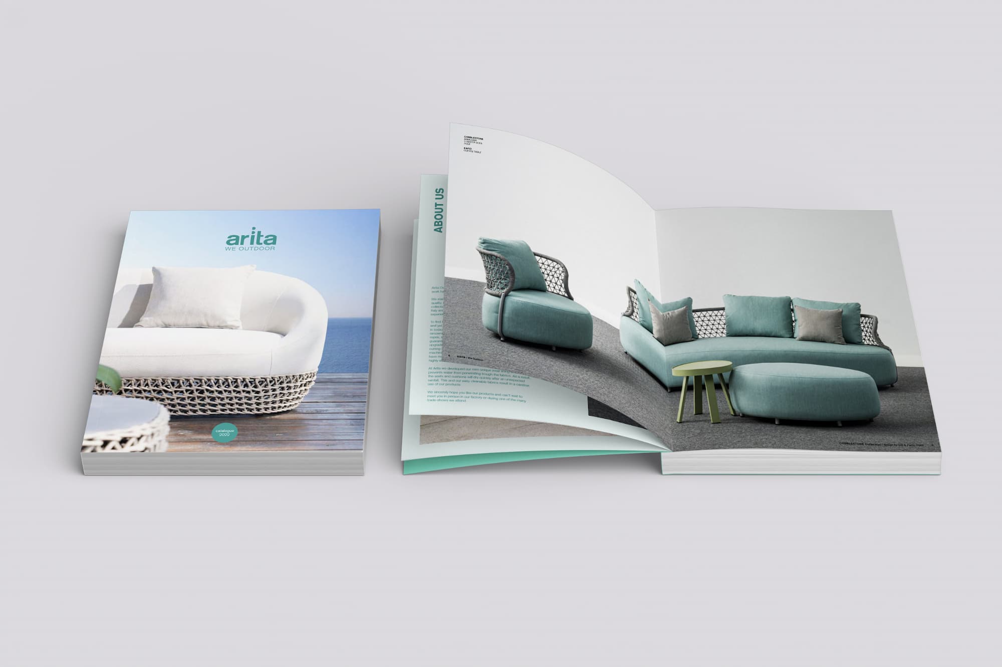
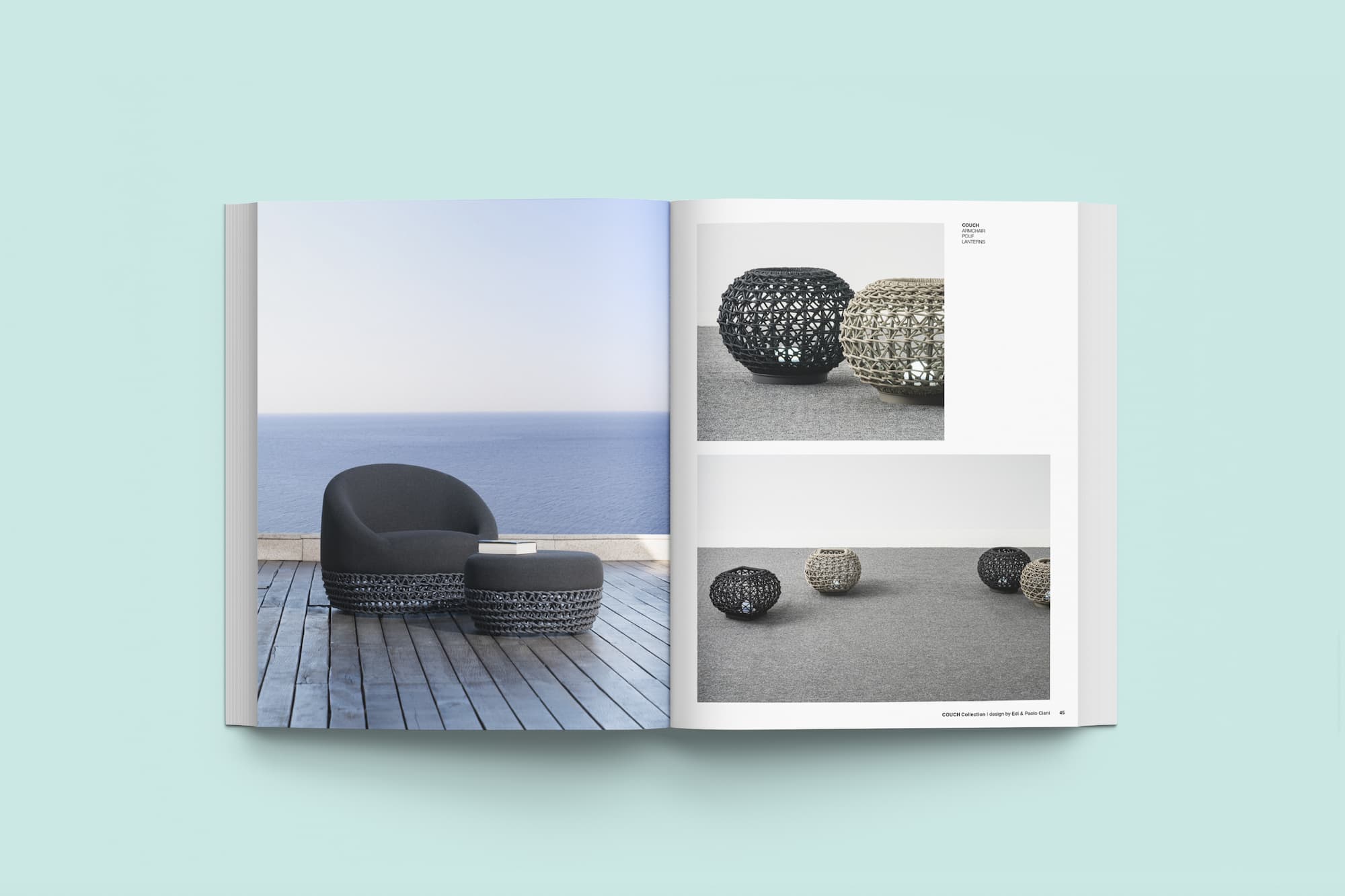
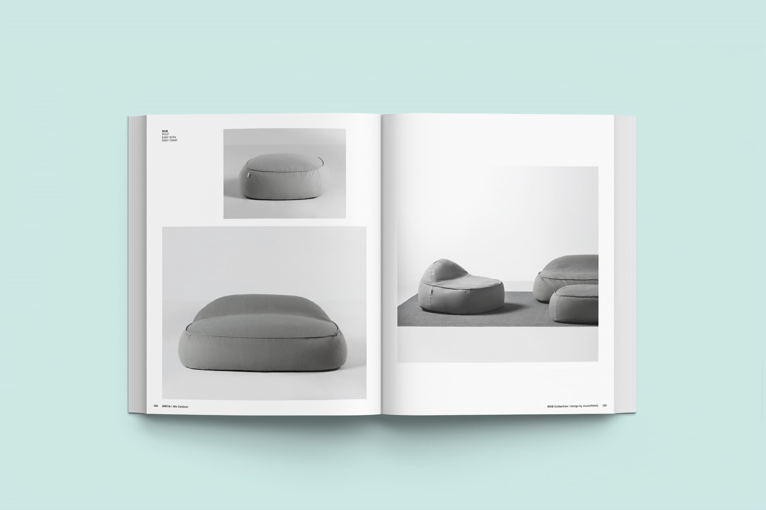
Design and implementation of the coordinated identity starting from the new logo. Fresh colors, sans serif font are used to describe the name of the company and are transformed into a background where punctuation becomes the protagonist, an extension of the company’s values and sometimes playing with letters, hints at contextual elements. The cuts on the geometric elements serve to give depth, creating a light play of wings.